News Builder is a major addition to Cameo’s template editor. With it you can compose structured mailshots from a set of ready-made, customisable blocks.
Edit the text and replace place-holder images with your own in the usual way in the template editor. Text can include substitutions, of course.
You can save individual blocks as amended, and these carry your own text for re-use as well as colour etc.
Contents
About blocks
Blocks include:
- an optimum width layout with differently coloured margins. Some blocks (such as an initial banner with a logo) can escape the normal width and display full width.
- multi-column layouts: interchangeable one, two and three column blocks, which optionally include a picture, caption, headline and sub-head, text and a call-to-action button. These wrap properly into a single column on small screens
- default branding colours
- optional calls-to-action
- ready made footers
- elements such as linked social media icons for your mail footers
which would otherwise be time consuming to construct yourself. - multiple event summaries and single event listings
- boiler-plate text, which you edit in the normal way
News Builder controls
Starting News Builder
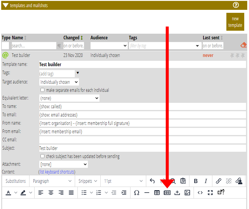
Open News Builder using the  button in the template editor toolbar (Fig 2).
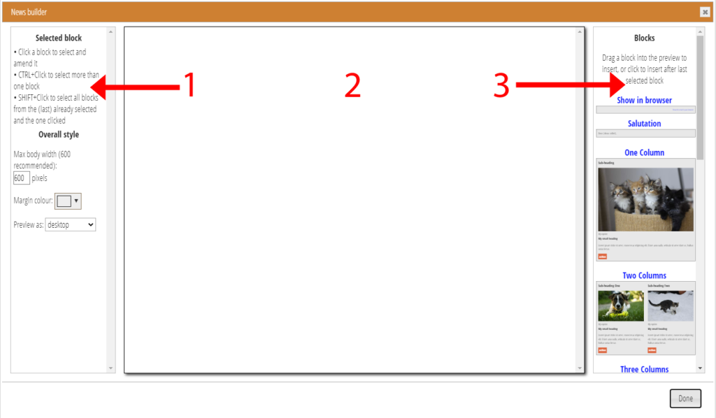
This opens a box (Fig 3 / Fig 1) where you can:
- choose blocks to include
- choose whether you want all parts of a block (for example, you can omit picture captions in blocks that have these).
- apply styling to them (change background colours etc.)
- re-order them as required
- save these adapted blocks for re-use in other templates (the blocks are in fact just snippets, albeit with some fairly specialised HTML)
Though this is a different editor from the main template, News Builder behaves just like the main editor, saving changes as you make them. Just close the box when done. You will see your blocks in the main template editor, where you can replace the place-holder text and images with your own real content.
The News Builder has three parts:
- Left: panel to control styling (Fig 3: 1)
- Middle: preview area (Fig 3: 2)
- Right: menu of blocks to choose from (Fig 3: 3)
Adding a block
To add a block to your template:
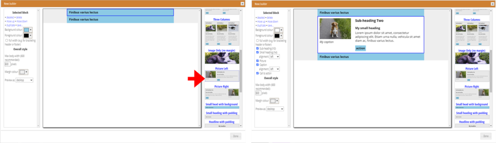
- Drag a block from the menu in the right-hand column into the preview area (Fig 4; a gap will open up between existing blocks where it will be inserted); or
- Click the thumbnail or title of a block in the menu (Fig 5). It will be inserted below the (last) selected block, or at the end if there is no selection.
- Duplicate a selected block using the control at the top of the left column when an existing block is selected.
Added blocks have styling applied like this:
- Primarily black on white when no other block selected and the thumbnail has a neutral background.
- In the same way as the (last) selected block when the thumbnail has a neutral background,
- Using an accent colour when the thumbnail shows this (the same
accent colour set for forms, so it is the main brand colour for your organisation by default). You can change this manually later if you need to, - Using the colours, text and settings shown in the thumbnail when you previously saved it as a customised block, as the thumbnail shows.
A block automatically selects itself when added.
Selecting blocks
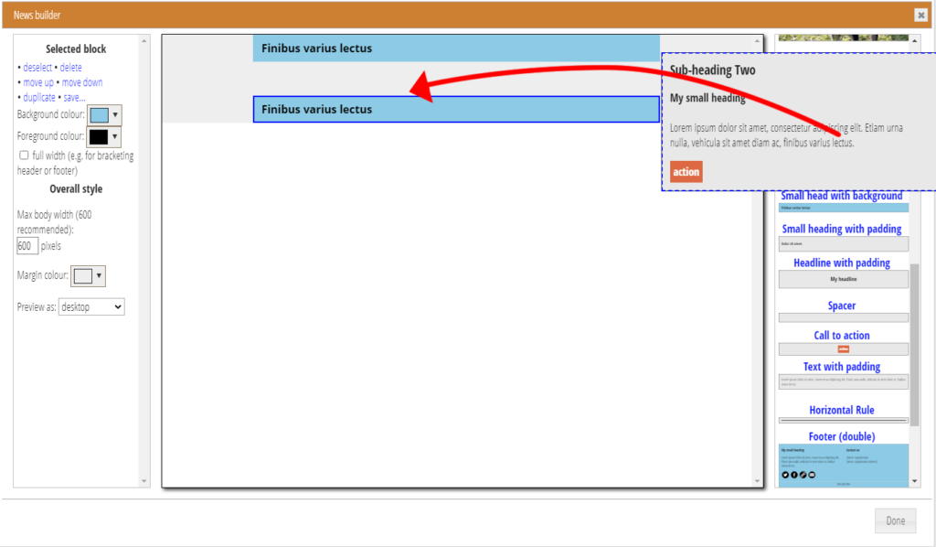
To select a block, just click on it in the preview area. A dashed blue outline highlights blocks as you hover over them.
You can select more than one block. This means all the selected blocks will have any stylistic changes you make applied them. To do this, hold the Control key down while clicking to add a block to the selection (or deselect it if already selected). Shift+Click to select all blocks including and between the selected block above and the one where you click.
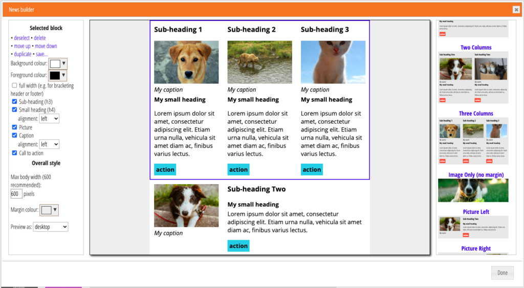
As elsewhere in Cameo, a dark blue outline indicates a selected block (Fig 6).
Re-ordering blocks
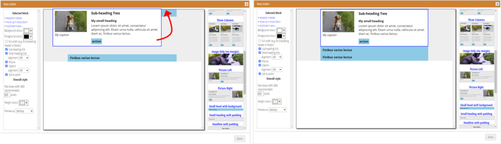
To change the order of blocks, either:
- drag and drop a block in the preview area (Fig 7), or
- select the block to move, and choose move up or move down.
Deleting blocks
Select the blocks you wish to remove. Click delete at the top of the left-hand column.
Styling
Individual block style
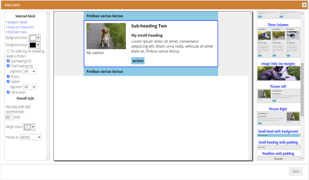
The controls at the top of the left-hand column apply only to the selected block or blocks. What is in the block determines what is offered.
For all blocks, you can change the background and foreground colours. You can also choose to have the element shown full width (extending beyond the margins of the email).
Below those you can choose to include certain elements of the block. For example, the Picture Left block (as selected in Fig 5), along with most of the multi-column blocks, offers
- a picture
- caption
- sub-heading
- small-heading
- some body text, and
- a call-to-action button
Omit any of these elements, other than the body text, by un-ticking the appropriate box. Similarly, blocks with social media links and icons, you can choose which to include and in what style.
Because content is also editable on the main template editor, you can also make changes there. For example, if you need a second body text paragraph you can just add one by pressing enter at the end of the first paragraph. Less commonly, you could delete the body text entirely. If either of those are common in your layouts, you can save them for re-use as new block types (see below)
Some of these elements have further formatting controls. For example, you can choose whether to left- or centre-justify the small headings.
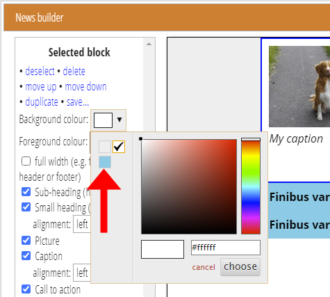
If you want to style a new block in the same way as an existing one, select that block before you add. The added block will then take on the style of the selected block. Alternatively, the colour should be available in the palette of the colour selector (Fig 8).
Whole template style
The group of controls at the bottom the left-hand column apply to the whole layout:
- The width of the layout (in pixels): the email centres the message of this width. We recommend sticking to 600 pixels unless there is an over-riding need to do otherwise.
- The colour of the margin outside this central column. A light grey is typical.
You can also change the width of the preview area to see how it would look on various smaller screen devices.
Incidentally, while you can only have one set of blocks in your template, you can have ordinarily edited content above and below the blocks.
Saving blocks
You can save blocks, where you have changed the style significantly, to the block type menu in the right-hand column. With the block selected, just press the Save link at the top of the left column.
The selected block (or the default black on white) does not apply its styling to blocks made from one of your saved block types. Instead, they retain their saved styles. You can change these after adding, though, if you need to.
Saved blocks are stored as snippets. So you can delete or rename one in the Snippets section when necessary.
Editing text and pictures
The News Builder lets you prepare the block elements of your email, but uses dummy placeholder text and pictures.
To edit that text, perhaps including more than one paragraph, and to replace the dummy pictures, close the News Builder box. You’ll see the template as you designed it in News Builder in the editor, like any other email. Just edit the text and pictures in the ordinary template editor, just like any other template.
You can add more blocks or rearrange or re-style your blocks later by going back into the News Builder.
Sending email
Outgoing email recognises that it contains a News Builder template, and adapts it before sending so that it contains two copies, one suitable for most modern email apps and the other suitable for Microsoft Outlook and related products (like Windows 10 Mail). Outlook uses a completely different method of displaying rich-text email which is unsuitable for small screens and has limited possibilities for layout.