
Make stylistic changes to all your forms so they match your website from the Colour Scheme and Style section of the Forms menu introduced in Cameo 9.
Many aspects of your website’s design are automatically applied to your forms anyway, such as the fonts and link colour and decoration. Some form-specific features, like the progress indicators and button colours need to be customised here to match.
Contents
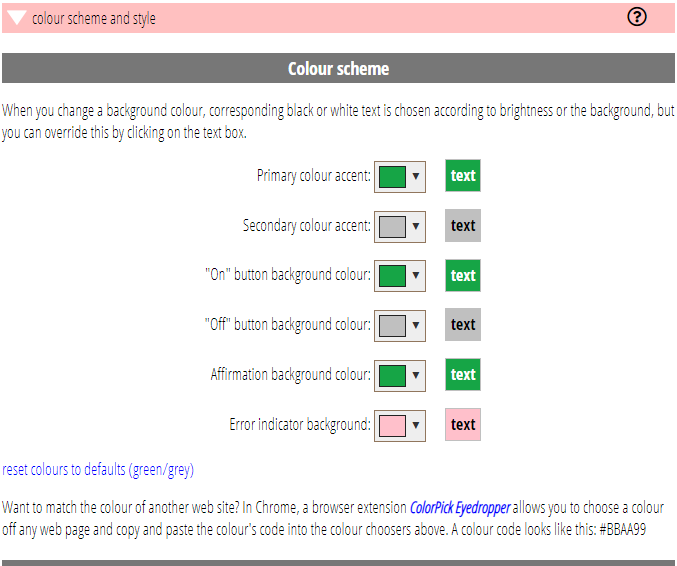
Colour scheme
Set colours for various parts of the forms, each with black or white text (which is automatically made contrasting, but in some edge cases you may prefer the opposite). Often the “positive” colours would all be set the same, but if your website’s main colours are reds, for example, it would probably not be wise to use that for affirming text.
- Accent colour is main colour used decoratively, for example in progress indicators. The primary colour is used for current and completed steps and secondary for those still to come.
- On/off colours are used on buttons which are or are not selected respectively, so that the selected answers are highlighted.
- Affirmation background is used to emphasise “thank you” messages and other ending steps for example, if we need to say “now check your email for a link to click”.
- Error indicator background is used when someone makes a mistake (for example fails to fill in a required form field), as both the background to the error message, and also to highlight the caption of the field that has the problem, where relevant.
Progress indicators
Progress indicators are shown at the top of forms to show how far through a series of steps the customer has got and to give them an expectation of how much there is still to do. Most forms only have two or three steps, but some, like the booking form, have four or five.
Previously, only the built-in chevron style was available. Now you can choose from the six styles illustrated for the progress indicators, including having none at all.
Un-ticking the box at the end for include progress indicators with only two steps also allows you to omit progress indicators when there would only be two steps (for example, for forms where the number of steps varies according to context), typically information collection and then confirmation (a thank you step).
Captions on each step indicator are specific to the form (and can be customised separately for each). However, the individual captions are substituted into a longer string set here to affect all the captions. For example, if you want only step numbers, not words, in the step arrows style, you can substitute only those here.
Similarly, you can make overall changes to the submit buttons, so that while the text may vary, it can be universally followed with an arrow, or some such.
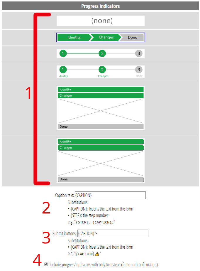
2. Add additional text to progress indicator labels
3. Add additional text to submit buttons
4. Include or not progress indicators when there’s only two steps
Typography
When embedded within a website, form content takes on the style of the site itself. This is particularly noteworthy for its fonts. However, when looking at the form in the form management section it is embedded within Cameo, so takes on Cameo’s styles.
To give a better sense of what they will look like in your site, you can set fonts, sizes and boldness here for different kinds of element, and these will be used (only) when the form is shown within Cameo. The B column can be used to override the natural bold weight of headings or ordinary weight of buttons and progress.
Sizes are expressed in CSS units, such as ’20px’ (no space after the number) but if you don’t provide a unit, pixels is assumed. Other units include ‘pt’ for point (e.g. ’12pt’), ‘%’, ’em’ and ‘rem’ which are relative to the body font size (in Cameo anyway).
While this doesn’t cover other stylistic aspects – many sites change how text input fields are presented, for example – it can go some way to making them feel at home in Cameo.
Additional CSS
CSS is the language that applies styling to web-pages. Someone who is familiar with CSS can add here any rules to change how the forms are displayed. Cameo forms are liberally provided with classes which CSS uses to identify parts of the form; these can be most-easily determined through a web browser’s developer tools.
The CSS given here is included in the form embedding after the main CSS Cameo provides, so the additional part can override these settings, but before the CSS the website provides itself.