
Cameo 9 introduces a new visual form editor. forms → form editor overlays controls on a real, embedded copy of the form where you can make changes and immediately see the effect. For example, a pencil icon  lets you re-word a chunk of text. The idea is you step through the form as a visitor would, using the controls to make changes as you go.
On live versions of Cameo, filling in the form:
- Doesn’t actually make any changes to your data.
- Sends any email to you, not to the person you’re pretending to fill in the form for (as a template test would).
- Only simulates making real payments and skips any email validation steps.
Where a form requires a personalised URL, you can search for an appropriate membership and then use the personalised link button, immediately above the form preview to run that form with a URL appropriate for that member, as it would if they clicked a link emailed to them.
Where a form has query parameters (the bits of a URL after a question mark) other than those related to a membership, a button simulate query is also shown, which allows you to provide values for these explicitly. These are remembered as long as you continue editing the same form, so restart form will do so with a URL which includes the values you set.
Contents
Customising forms
Each form type is different but they follow a similar pattern. Follow through the workflow of the form as someone filling it in would, making changes as you go. In some cases, multiple choices reveal or hide parts of a form, so if you want to check or change all the text, follow all paths through the form.
To save repetitive typing, you can fill in the details required by the form with those of the selected membership alongside using the fill form with selected membership link just above the form. Similarly you can use invented details to fill with fictitious entries where appropriate.
Sometimes there is no sensible default option for a new form: you need to choose. For example, where payments are required, you will need to choose the payment method(s) you want to offer, and the form will not work without this choice. When this happens, a blue box is shown explaining this and what to do. Usually you can click the box to make the appropriate change. These blue boxes are not visible in the live forms, but usually the form will not work properly without changing the setting indicated.
Change wording
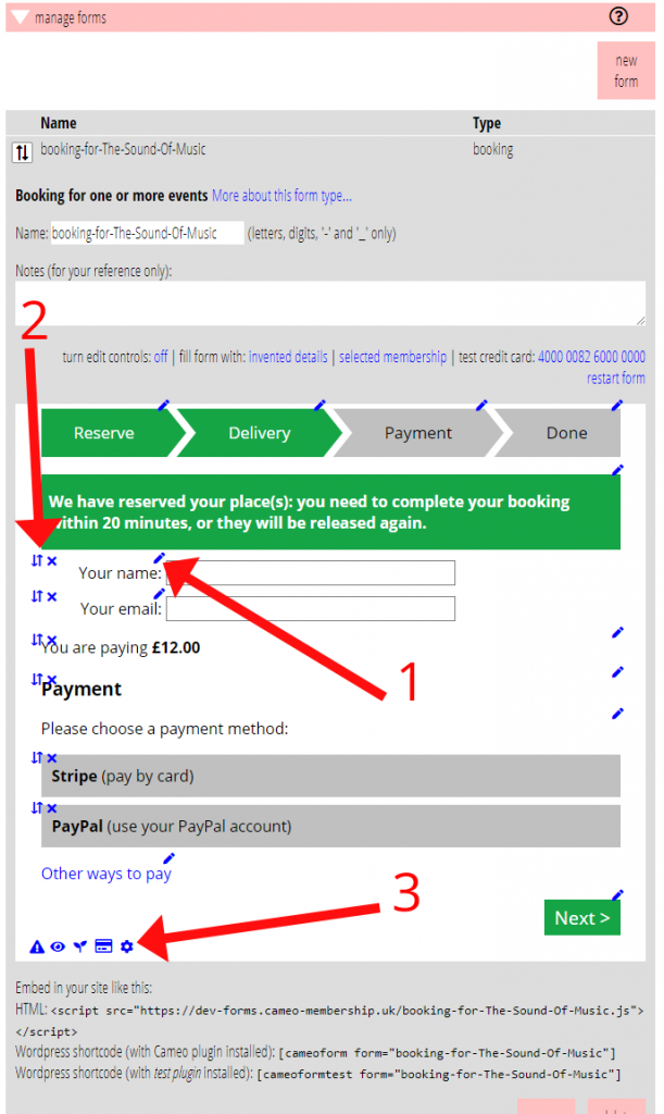
Any text that can be customised is shown with a pencil icon (Fig 1: 1)
Hover over the pencil to see the area of the form it applies to. Click the pencil to amend the text.
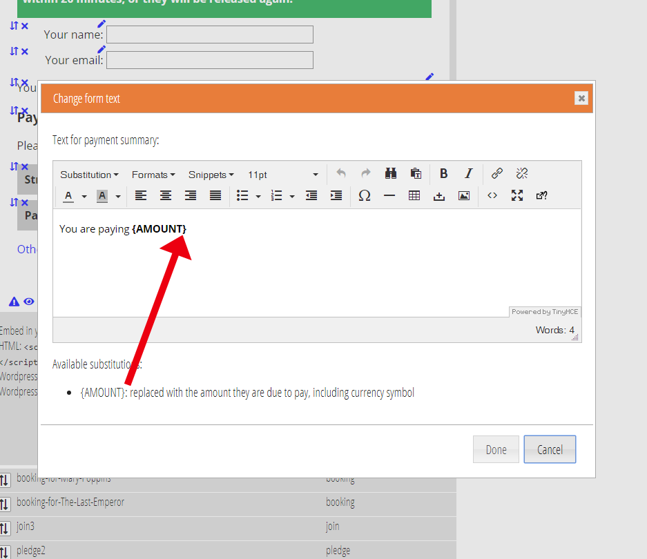
In some cases, you can include substitutions in the text which are filled with real text when the form is displayed, listed in the box where you change the text; and if it is rich text, the substitutions can be inserted from a menu, as for a template (Fig 2).
The editing box may also provide additional information about the context of the text.
 Change error messages
You don’t have to provoke every error in order to see it’s message! Click the warning triangle icon (Fig 1: 3) to see all the possible error messages, which you can then customise by clicking the relevant . This is the first time error message wording has been customisable.
 Change content and order
Many form types have options that let you customise what information you ask for and in what order. For example, the membership renewal form can be set up to show a section for asking for an additional donation. These are controlled by the eye icon (Fig 1: 3). Hover over this to see the area in which elements can be included, excluded and re-ordered and click to see and change the choices.
⇅ × Remove and re-order
Though you can remove and re-order elements in a group of options by clicking the eye, you can also do either of these directly on the form preview. Each enabled option has a pair of icons with which you can remove × or drag to re-order ⇅ (Fig 1: 2).
 Payment methods
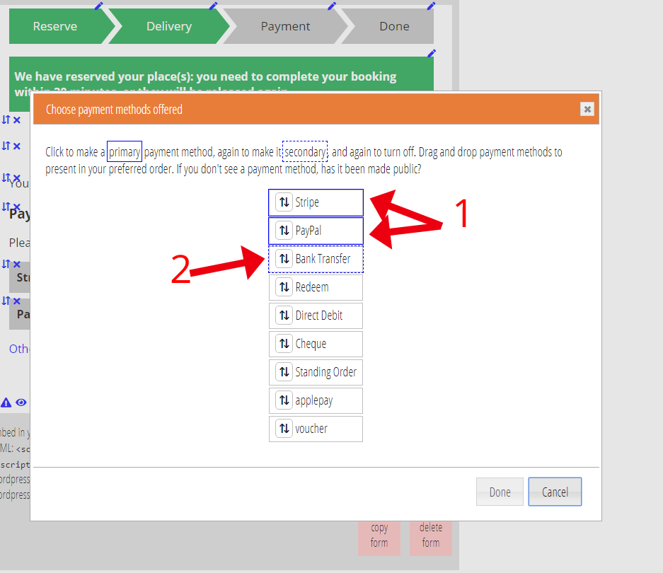
Where a form takes payments, the payment methods you offer are selected using the credit card icon (Fig 1: 3).
You can choose to offer only one payment method, in which case only a description of the amount and method is shown in the form. When you offer more than one, buttons are offered for them to choose between (Fig 3: 1).
You can also offer secondary methods. Click on an already selected method to make it secondary; these are shown with a dotted blue outline (Fig 3: 2). In this case the primary methods are shown in the form along with a link to “show other payment options”. Clicking that link reveals the secondary buttons.
 Settings
The cog wheel icon (Fig 1: 3) gives access to settings which affect how the form behaves rather than how it appears. Click to see the available settings and click one of the settings it reveals to change it.
For example, the booking form lets you control the maximum number of tickets that can be ordered in one booking. This is also where you will find things like the names of query parameters that can be used to personalise links to the page embedding the form (it would only rarely be necessary to change these).
 Email
Email
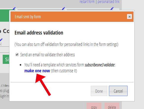
Where a form can send an email, this is indicated by the envelope icon. The actual content of the email is determined by a template set up to service the form.
Hover over to see a short description of the context (for example, confirmation email) and click to turn the email on or off: so if the form can send an email to verify the address they give, you can arrange to skip that step by turning the email off.
The email control panel also shows you the template which is servicing this email (as a link so you can look at and change the template). If no template has been added, a link is provided to make a suitable, but brief, template, which you will often want to customise further (Fig 4).
Each form offers its own set of substitutions which can be inserted into the email in the usual way (and the proforma templates illustrate the use of these) – typically these are responses given to the form or derived from them (the amount they have paid, for example, or the URL of a verification link).
 Custom fields
Some forms offer additional custom fields. For example, the booking form can collect additional information of your choice in single- or multi-line boxes, or by selection, on both the reservation and payment steps. You might use this, for example, to ask for any dietary requirements if the event has catering. These are defined using the seedling icon (Fig 1: 3).
Once you have included a custom field, it appears in the form options so it can be re-positioned (or indeed turned off) like other elements, and its caption/prompt and, where relevant, button labels, are changed like any other text with .
Where the responses end up depends on the form. For the bookings form, they are stored wit the booking and revealed with more info in the table of bookings in the reservations, bookings and attendance section.