Refine used to be a section in the Search More menu, though there were some short-cuts for some parts of it at the top of the search results. Now, the whole caboodle has moved to the top of the search results set.
As well as being much easier to get at, it’s now possible to dismiss an item you’ve dealt with even where opening up a section refreshes the set of results (preventing navigating to the old Refine and back again, even if it hadn’t been so tedious).
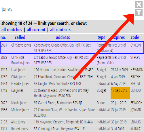
Start by clicking the new Refine button underneath the Clear search button in the search bar:

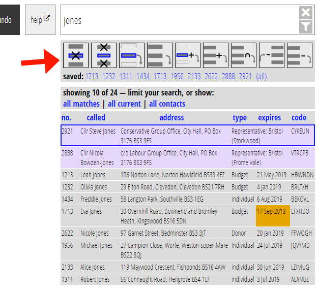
This toggles a new panel at the top (click again to turn off):

The buttons do exactly the same as those in the old Refine section, to combine the set of search results in various ways with a saved list, but I have tried to make them more visually descriptive (tool tips show in words if you hover). The help that describes exactly what these do has moved to the introduction (here in the demo installation)
Note in particular the first button which dismisses the currently selected item. Typically useful when you’re manually processing a set of people, have dealt with one, and are ready to move on to the next. (Some sections, like Enrol do this for you as you process entries, but this function extends that to any kind of processing. I think this will be particularly useful in the Welcome Contacts section, for example, where you might want to partition the list before sending messages).
This change also lays the groundwork for potentially having other shortcuts at the top of the search results, without them getting in the way. For example, I can envisage possibly putting a list subscribers button here – after all, lists are essentially saved searches.
