Forms now put captions above the corresponding field.
Contents
Background
Previously, on typical desktop and tablet window widths, a form tried to put the caption for most fields before the field. To ensure everything lined up neatly, this involved calculating the width of each caption, discounting any long ones, and setting the rest to the width of the widest, as shown (Fig 2).
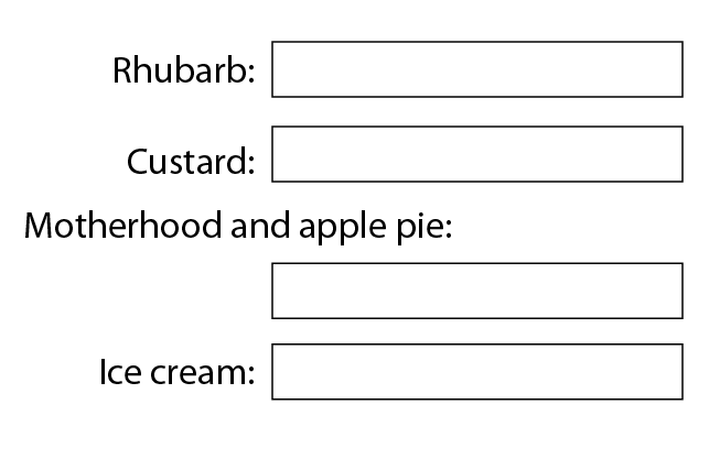
While giving a neat layout most of the time, this strategy didn’t work properly in a few situations. As you can edit all captions, sometimes a default short caption could become quite long. The Back button was a particular problem. Currency symbols could also come adrift from their box in limited space.
New layout
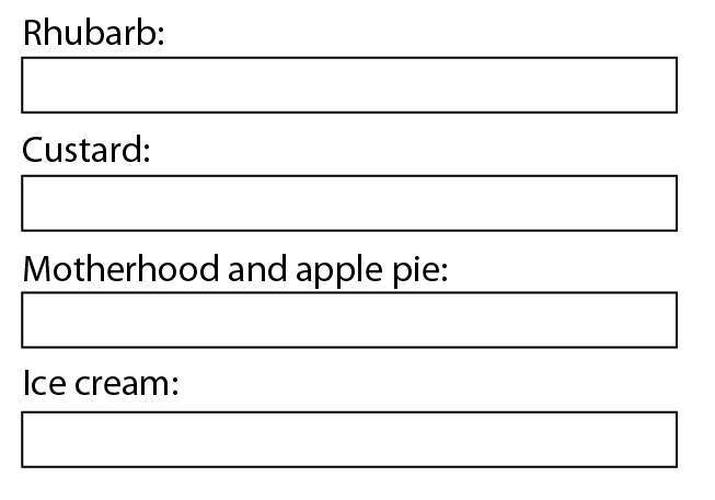
Forms now usually place captions above each field (Fig 1). Small screens already always used this layout.
This removes the need to calculate widths when displaying the form, dealing with most of the problems. It makes the forms just a bit longer on desktop-size windows, but with neater alignment.
There are a few special cases: for currency amounts, postcodes and other input which always expects very short text, the form reduces the field width and presents it alongside the caption.
The forms now place most multiple selection buttons centrally, below the corresponding caption. (Previously, where possible, they would have lined up with the text input fields, which looked good when there were several, but the spacing looked a bit odd when the buttons stood alone).
T&Cs
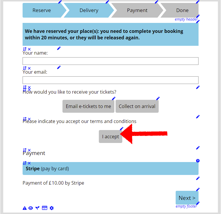
For consistency with other forms and fields, the optional terms and conditions tick box in the booking form now shows a toggle button instead (Fig 3).
Tick boxes are small by default, and hard to touch on a phone, so the booking form enlarged this one. However, that often clashed with the embedding web site’s styling. The introductory paragraph also did not usually wrap well around the enlarged tick box, where now it is just a straightforward paragraph.
This means there is now an additional button label, just I accept by default. You may wish to consider whether you prefer an alternative wording if you use this option in the booking form.