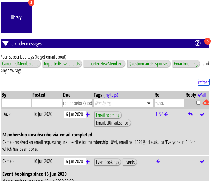
Many of Cameo’s sections use tables to display the items they are concerned with. Some of these have filters at the top to find subsets of items according to various criteria. As these have been added at various times, while generally similar, they have not all been completely consistent. So, I’ve done some tidying up to bring them into line with each other and added a couple more filters – for events and forms.
Contents
Cosmetic changes
- If there is a New button, it is always at the top right above the table. (This was the case for most except the tables in Organisation settings). New items are also always added at the top when you click New.
- Delete buttons are at the bottom right of any expanded detail, or have a red × at the end of a row where there is no detail to expand. (A few sections still had a small × in the detail which are now consistently proper buttons).
- Other operations on the item as a whole (like Copy and Send) are bottom left. (In a few cases, these were previously the other way round with Delete).
- Headings now have a slightly darker background. These enclose any filters.

New filters
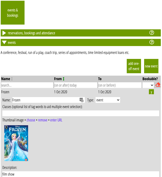
- The Events (Fig 2) and Forms sections now have filters
- The rag-bag of filters at the top of Reminder messages has now been brought into the table headings for searching messages by date, tags, related membership numbers and whether the message is marked completed.

Getting started
There is also an article introducing tables of items and filters.
