The templates section in the communications menu looks a little different and has several new features to help you find and manage templates. There is no change to how templates work or how they are used, just the presentation.
With many more templates in use, the previous four menus of template names was becoming inadequate (in particular, searching for text in templates was requested), and was inconsistent with how other sections display lists of things.
So template summaries are now shown in the same “accordion list” style used in other sections, with filtering on various properties and control over their order. This should make finding the template you want rather easier.
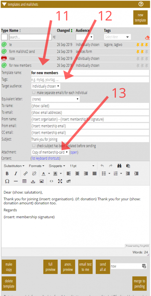
As with other similar lists, click on a template summary row (Fig 2: 11) to show the template detail, with the content, buttons for merging, copying, preview etc. This remains unchanged, except for the addition of tags (see below).
Email attachments now have their own distinct type (see below).

Contents
Filters and text searching
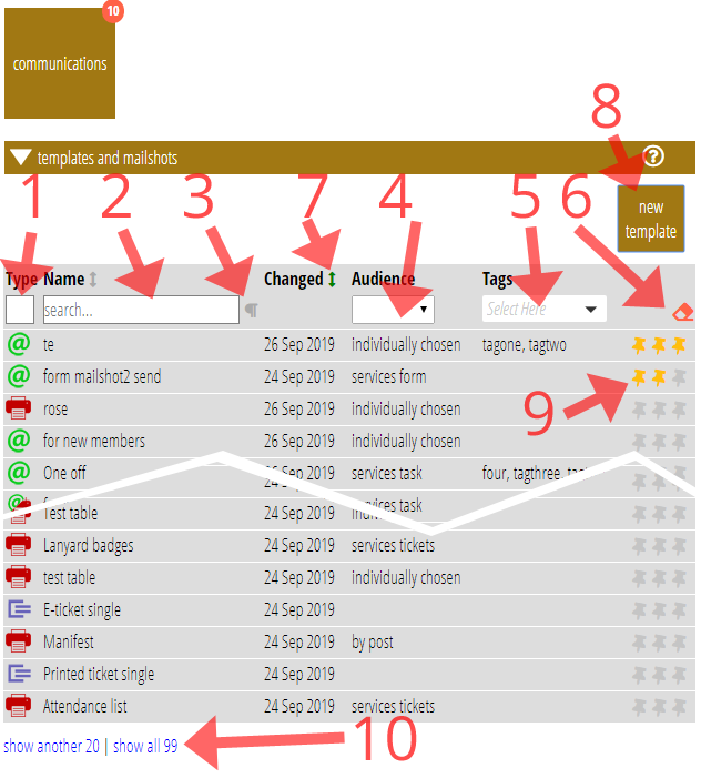
Use the boxes in the table’s headings (Fig 1: 1 – 5) to filter which templates are shown. You can do this (in combination, if you want) by:
- type (Fig1: 1),
- dynamic searching for words in either the template name (just start typing in the box, Fig 1: 2), or the name and content – click the paragraph symbol (Fig 1: 3) alongside the box to include content (content is HTML, but the search does not include HTML syntax elements like “div”, just the ordinary words),
- audience category (Fig 1: 4 – is it for a form, a task etc),
- tags (Fig 1: 5: see below) – menu not shown if there are no tags,
- clicking the eraser at the right (Fig 1: 6) to clear all the filters.
Order
Display the list in either alphabetical order of name, or the by most-recently changed: click the arrows (Fig 1: 7) next to the Name and Changed headings to change this (it is remembered for next time).
Hover over the changed date for a template to see the time as well, and who made the most recent change. (Initially, they will all say anon as this reflects the changes that were made to introduce these new features, but this will change as time goes on).
Twenty templates (matching the filters, if any) are shown initially. You can add a further 20 or show all (matching) templates with the links under the list of templates (Fig 1: 10).
Pinned templates
However, as before, your personal priority templates are always displayed first. The indicator has been changed to a pin (Fig 1: 9). Three pins for nearest the top, two next, then one. Click the pins to change this (click one pin again to clear it altogether). Changing priority doesn’t immediately make the template jump up or down the list, just when it is re-filtered or the section opened the next time.
New templates
While copying an existing similar template may well still be the best way to get a new one, for the first time there is now a new template button (Fig 1: 8) to create a nearly empty template. It asks you what type you want when you click it.
Tags
Templates can now be assigned tags to help group them. The tags filter menu (Fig 1: 5) can then be used to show only those templates with matching tags.

Tags are added in the new box for them in the template detail (Fig 2: 12). Just enter a list of words separated by commas or semi-colons. Any not used before will be added to the filter menu automatically.
Attachment templates
Email PNG attachments were added to email templates a while ago. An attachment is made from its own template converted to PNG image format at the time the email is sent. That template is selected on the Attachment menu in the email template which is to have it attached (Fig 2: 13).
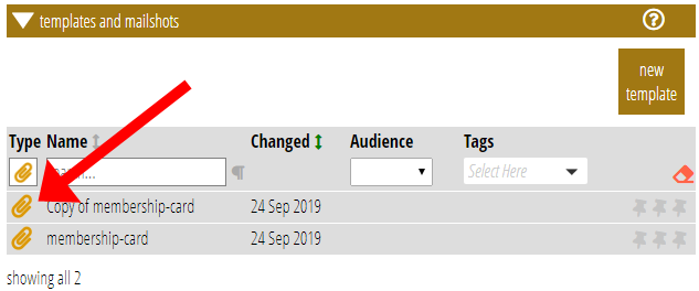
Previously an attachment was defined as an extension of a subordinate template, already used for including in other templates. Now, however, attachments have been separated out into their own template type. This is indicated with a yellow paperclip icon.

