
The image selector in the template editor, and elsewhere, now offers the option of including all sizes of the chosen image in the HTML for the document you’re editing, so the browser can choose the most appropriate.
Contents
Background
A web page may display an image at different sizes, depending on the context (phone vs. desktop, for example). A retina display benefits from an image with more pixels even though the displayed size is unchanged. Conversely, slower connections may benefit from downloading an image with fewer pixels than they might do on faster networks. If the browser knows about various sizes available when it displays the image, it can choose the best compromise between most appropriate for the displayed size, the image quality and download speed.
Recognising this, some media sources – WordPress in particular – resample images uploaded to it, store them at multiple sizes, and offer the browser all the size alternatives when pages that include images are displayed.
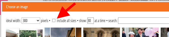
Image selector
Cameo can now take advantage of this as well. Tick the include all sizes box at the top of the image selector (Fig 1). Cameo then includes the image in your content with multiple sizes if the source of the image (such as your WordPress media library) offers alternative sizes.
You should still choose the ideal width in the previous box. Doing that means the browser uses the most appropriate size in places where it can’t choose an alternative (like email apps that only understand a limited subset of HTML, such as Microsoft Outlook).
Multiple sizes are most useful in event listings, via Cameo’s event listings WordPress plugin. However, you may also find them useful in email. Many email apps aren’t very good at displaying general HTML, but those that are (primarily GMail’s webmail app) make use of the alternative sizes. Others will behave as before and just ignore the list of alternatives in the HTML.
How it works
For the technically minded, Cameo does this using the srcset attribute of the <img> element, like other applications. WordPress uses that as standard in its pages and posts when you include an image.