Cameo displays attachments more consistently.
Contents
Background
Once upon a time, you could attach files to membership records. Then we had the file store and bank statement attachments. Now we have attachments all over the place, so it was time for some rationalisation.
Changes are mostly internal. Cameo now uses common code to manage pretty much all aspects of attachments. But because of this, some attachments have changed their appearance a little.
Attachment cards
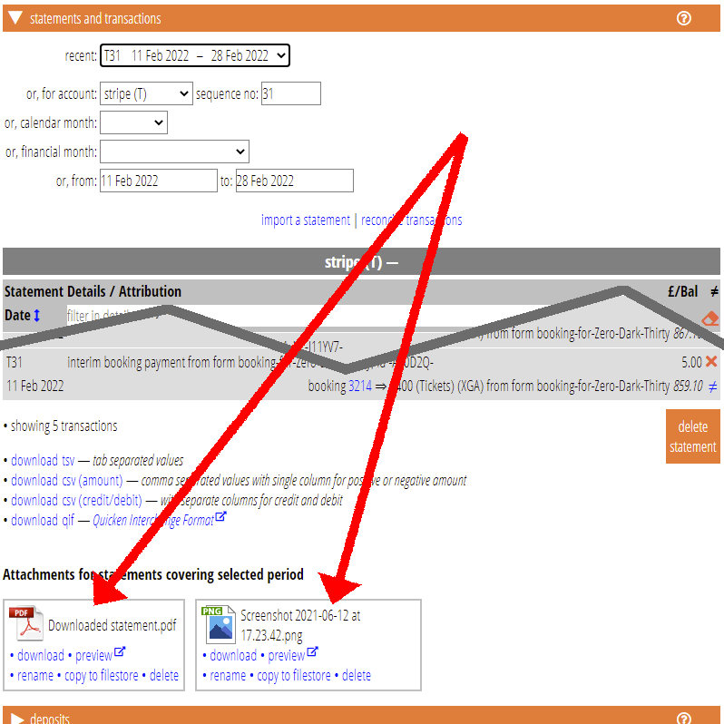
In many cases, we show attachments as cards. These include an icon indicating the file type, the filename and various common operations to preview, download, rename, delete and so on. For example, Fig 1 shows a couple of files attached to a bank statement.
Attachment cards also include copy to file store which wasn’t offered for many attachments previously, but should have been.

Attachment detail
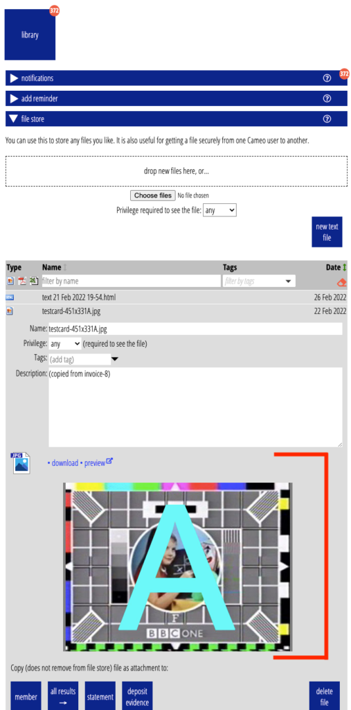
In other places, where the attachment is central to the task (file store and member attachments), we show a common, more detailed block (Fig 2). This includes:
- icon,
- preview and download links, and
- an inline preview if appropriate for file type.
For the inline preview:
- images: we show a medium-sized version of the image
- text (html) we include the text editor
- PDF, we use the browser’s built-in preview (where available)

