
In your profile page, you can now turn on a variation in the way the membership records are laid out (in the third column, under the search box).
UPDATE June 2020: the older default has now been removed. Accordion-style is the standard way now. There is no longer an option in Profile
Contents
what’s the problem?
When there are quite a few search results there is a lot of scrolling involved to see or amend the selected record detail. The aim is to bring the detail nearer to hand.
A longer list also means the count of messages etc is off the bottom of the screen.
what’s the solution?
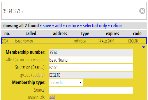
I propose to make this behave more like the other sections in Cameo which list things. That is, to expand the detail immediately under the summary line, and open and close it by clicking on the summary line. I think this will make it more ergonomic.
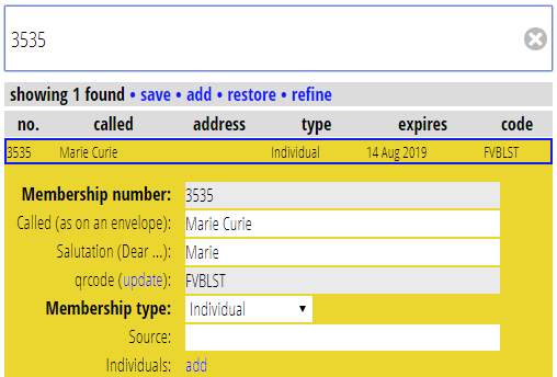
If there is only one search result, then detail would be displayed automatically
But if there is more than one you would initially see only the list:
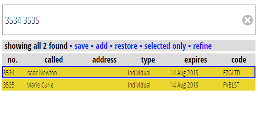
The record count and related controls move to the top, so they are always accessible.
With a single result, or a long list of results you would notice little difference. A single result is laid out almost the same as before. With a list, you couldn’t see the first record detail as it was below the screen, and you had to scroll to see it, so initially it would look similar, but when you want to access a single record, you just click it, no scrolling involved.
is there a downside?
For short lists, seeing the first result requires an extra click: previously you’d see the first record under the short list and could go straight to it. (For later records it requires a click anyway, so is ergonomically the same).
Also if you open the first result, then the second result is now harder to open than previously – you’d have to either close the first and then open the second, or scroll down to below the detail to pick up the rest of the list.
to mitigate these:
- there would be a button at the top right of the detail panel to jump down to the next detail:
the SHIFT+DOWN-ARROW keyboard shortcut would do the same. SHIFT+UP-ARROW also goes up one (though that’s easy enough to click with the mouse)
Pressing ENTER when searching (and also so long as some control isn’t focussed, where ENTER means submit) it would toggle the first result (also UP and DOWN arrows move through the list)
ESC also toggles the entry detail does the same, even when in a control (why have ENTER to do this at all then? It’s just that it’s a more natural key to press in that context)