Image resolution is a measure of the density of pixels in a picture. More loosely speaking it is a measure of image quality and a trade-off between how people perceive pictures and how much resource they use.
Contents
Background
You need to know about image resolution when sending emails or printing letters from Cameo which contain images. They need to have enough pixels to maintain quality, which depends on the physical size you want to display them at, but not so many that they overwhelm the internet connections (at either end).
You may need to use an image editor (even a simple one like Microsoft Paint on Windows or Preview on Mac) to adjust resolution. WordPress can also adjust resolution for you in web pages and provide several different sizes from your original for use in emails.
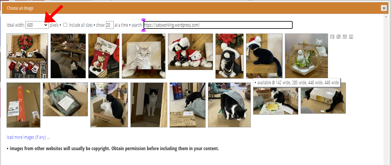
For emails, the image selector has a control in the top left corner to select between versions of an image with different numbers of pixels depending how big you want to display it (Fig 1). For printing, you should include images at 300 dots per inch resolution, whether in:
- stationery (a letterhead scan, for example),
- directly in the template text, or
- signatures substituted from organisation settings.
This article explains what pixels and resolution are and why they are important.
About pixels
A picture is made up of a rectangular grid of tiny coloured dots. Each dot is called a pixel. We may loosely use dot and pixel synonymously. So, we can say an image is so-many pixels wide by so-many pixels high. The total number of pixels in the image is width × height. Because images generally have lots of pixels, for convenience we talk about megapixels (or MP), one million pixels. A picture which is 1,000 pixels square is 1,000 × 1,000 pixels = 1,000,000 pixels, or one megapixel.
Usually each pixel comprises three numbers: the amount of red, green and blue, each a value between 0 and 255. One byte of computer storage stores a maximum number 255. Therefore you can store a pixel as three bytes. So, naively, a 1MP image would use 3 megabytes (MB) of storage (let’s say approximately, as megabytes sometimes means1,024 × 1,024 bytes rather than 1,000 × 1,000).
compression
However, in practice, you usually compress pictures for storage. Compression recognises that neighbouring pixels of an image are more-often-than-not quite similar to each other. Computers therefore usually store images as small differences between pixels (often calculated in quite complex ways) rather than the absolute value.
Different formats use different compression calculations, often chosen according to the subject matter. A photograph has more variation over an area, for example, than a logo, which often has large areas of exactly the same colours. So in many cases, image file sizes can be a fifth or a tenth of the number of bytes in the uncompressed image. Storing metadata about the image (such as its width, height, origin, orientation and geographical location) also slightly affects file sizes.
But in the end, an image has width × height pixels. This is independent of how it is stored or displayed. It is a measure of how much data it contains.
Display
When you display a picture, whether on paper or on a computer screen, you do so at some specific, physical size. You might show your 1,000 pixel wide image to be 100 mm wide. Sometimes the technology used may change that size for you (and it may be hard to know the physical size in advance).
For example, a picture on a web site may show up 100 mm wide in most cases, but on a small phone, it may only display 60 mm wide (rather than cropped) because 100 mm is too wide to fit on the screen. Nevertheless, it still displays at some physical size. Usually, you will know at least the maximum size which you intend.
resolution
This means we now have both a number of pixels and a physical width. Together these express the density of pixels, the ratio of number of pixels to physical size. This is known as the image resolution. So, when our 1,000 pixel-wide image is displayed 100 mm wide, the resolution is 1,000 / 100 = 10 pixels per millimetre (ppm). But when it is only shown 60 mm wide, it’s resolution is 1,000 / 60 = approximately 16.7 ppm.
Notice we now have three numbers:
- number of pixels
- physical width, and
- the resolution.
But they are not independent. If you know any two you can calculate the third:
- Resolution = number of pixels divided by physical width, the ratio.
- Number of pixels across = resolution times physical width
- Physical width = number of pixels across divided by resolution.
Because of the influence of the USA on the technology, resolution is often conventionally measured in dots per inch (dpi) rather than pixels per millimetre. For display purposes, dpi arguably also produces more conveniently numeric range. As one inch is 25.4 mm, our 16.7 pixels per millimetre resolution is about 16.7 × 25.4 = 423 dots per inch, and 10 pixels per mm is 254 dpi.
dot pitch
You could also measure the inverse of resolution (which is typically expressed in metric outside the USA). This is known as dot pitch, the measure of the distance from one pixel to the next, which, assuming the pixels are scaled to fit without gaps or overlap, is how big a single pixel appears
So, a resolution of 10 pixels per mm is a dot pitch of 1 / 10 = 0.1 mm per pixel: each pixel is 0.1 mm wide. And a resolution of 16.7ppm is about 0.06 mm. As you can see, a higher resolution means each pixel displays smaller physically.
image quality
Resolution matters for two main reasons:
- image quality, and
- bandwidth
If you have too little resolution, then picture quality will be poor. Fundamentally, this is because the human eye tends to automatically blend adjacent small dots of colour together as a continuous tone (ultimately determined by the density of rod and cone cells in the retina and the way the brain perceives the signals coming from them), but it sees edges between adjacent larger dots. So at too low a resolution, either:
- the pixels themselves will be visible (Fig 2: 3), or
- the display technology may try to smooth out the difference, in which case it will appear fuzzy (Fig 2: 4).
With sufficient resolution, you can’t do better by increasing it further. However, there are other image improvement techniques available: in Photoshop, for example, there are various sharpening tools which increase edge contrast within the image (fig 2: 2).

(1) 100 dpi (~3.9 ppm, each pixel is ~0.25 mm wide) when displayed on a typical monitor 40mm wide: we can’t do better than this just with higher resolution, except on retina displays
(2) also 100 dpi, but with Photoshop’s Unsharp Mask tool applied (at 50% radius 1 pixel): sharpening increases edge contrast within the image
(3) 10 dpi (~0.4 ppm, each pixel is ~2.5mm wide), no smoothing, you see the individual image pixels
(4) 10 dpi, pixels smoothed by averaging between them, using Photoshop’s bicubic sampling method
Consider a 100 × 100 pixel logo. If we display this 10mm wide (10ppm) then our pixels are 0.1mm wide and the eye would typically see them as continuous, and see a sharp edge where colour varies significantly between pixels. But if we display it 30mm wide, then each pixel is nearly a third of a millimetre, which means the edge between pixels is too great for the eye to blend, so you see the rectangular pixel grid.
So now, we can understand what quality means: it’s a measure of the eye’s ability to not perceive the edges of pixels.
marginal resolution
In fact, 10ppm (254dpi) is marginal for printing. You may be able to perceive pixel edges at that resolution, especially along high contrast edges, such as black text on a white background. You’ll see steps along diagonal edges, so-called jaggies or, more technically, aliasing. You are seeing the edges of the pixels that make up the characters. But if the display smooths these out (it invents intermediate pixels with averaged tones), then you most likely won’t see this: it fools the eye once more (called anti-aliasing). You’re effectively trading off fuzziness for jagginess. But you can only push that so far: if you increase the resolution artificially, then the eye will start to see the edges as fuzzy. Short of using AI to invent the detail, you can’t scale an image up and expect to retain its quality.
Most printers have conventionally adopted 300 dots per inch (12 ppm) as a rule of thumb for adequate image quality. On the other hand, many computer monitors will typically fool the eye adequately at a little under 100 dpi (3.5 to 4 ppm). We’ll see why this is below (and why some displays are better than others).
For most people’s perception, that means you won’t see the pixel edges. And any higher resolution won’t help because the limitations of the underlying technology start to become the dominant quality factor beyond that.
too high a resolution
While higher resolution won’t help, it won’t prevent image display. So why not just send images with lots of pixels all the time? Firstly, you may not have a huge image available. But also, more pixels to move around disks and around the internet takes more time and uses more resources, particularly bandwidth.
In the early internet days, this was absolutely critical. Images with even a moderate number of pixels took far too long to load over a dial-up modem. Now, however, this is less crucial. Nevertheless, a 10MB JPEG file still takes 0.1 seconds to download over a perfect 100 megabit/second broadband, and people often give up on a web page if it takes more than a second or so to load.
But more importantly, mobile internet is becoming the dominant connection mode. Mobile phones now make more than half of web page accesses. In some ways this is a step backwards: currently mobile internet is slower than broadband (though is changing rapidly), so image size is still a significant bottleneck. Also, mobile internet tends not to be paid for in unlimited quantities, so by supplying someone with a much-too-large image, you are both slowing them down and forcing them to pay for the unnecessary pixels.
srcset
So we need to strike a balance: enough pixels to display well at the desired size, but not so many that it gets in the way. Web technologies now exist (srcset) to allow a browser to select among different files (usually the same picture sampled to contain different number of pixels) offered by the web server, so it chooses the best one for the resolution that will produce the best compromise. WordPress and similar make multiple copies of any image when you upload it, at different sizes, so when they produce a web page containing an image, it offers them all for the browser to choose between.
Unfortunately, though, almost no email readers do this yet (even those which show you the images in a web browser, so could easily do so), so this is still an issue you must think about for now. Cameo includes all the sizes where available, so for the few email readers that do take notice of this (and this should be more over time), your images can take advantage of it.
image attachments
Because the recipient usually downloads an image in an email from your website they receive it, and only includes a reference in the original email, its URL, as it leaves Cameo, it is quite small and independent of image resolution. However, if you were to include image attachments embedded in mailshot emails, bandwidth at the Cameo end would also be an issue.
While any one image, even a big one, is not a big deal, when multiplied hundreds or thousands of times, it uses a lot of bandwidth (and time) to send the emails, which also ultimately costs real money. For this reason, we discourage non-personalised attachments. While occasional membership cards are fine, attaching lots of images to all mailshots is not.
Display technologies
The medium on which a picture is displayed is also, notionally, a rectangular grid of pixels. This may be a printed page or a computer monitor. The technology which reproduces coloured dots is quite different between these.
computer monitor
Each pixel on a computer monitor displays a colour, just like the pixel in an image file. But only one colour, so if the the resolution of an image is higher than the display resolution, you won’t gain anything. Whether a displayed image is higher or lower resolution than the monitor, the technology (web browser, email client or whatever) scales it to fit.
Like an image, the resolution of a monitor is the ratio of the number of pixels to its physical size. A monitor is usually quoted as “27 inch” or whatever. That’s the measure of the diagonal (and, misleadingly, may sometimes include the bezel around the edge!). So the physical width also depends on the aspect ratio. My 27″ monitor is about 590mm wide.
For a long time, the conventional resolution of a computer monitor was taken to be 72 dots per inch, and you may still see this figure quoted. But it hasn’t been correct for a long time: it’s a left-over from the days of cathode-ray-tube monitors. Most ordinary monitors sold now are around 90 – 110 dpi (marketing materials usually quote the dot pitch, the inverse of this). My large monitor is nearer 110 dpi around 0.23mm dot pitch.
Retina displays, on most Macs, iPhones and iPads are double that or more. Resolutions of 250dpi are common, nearing the printer’s ideal of 300dpi. This means text is sharp and crisp. It also means they can produce higher quality images if there are enough pixels in the original. So, given the choice, a Mac browser may well request a larger image file than the equivalent PC (with a conventional resolution display). In principle, an iPhone could vary its choice depending on whether it is working on a mobile or broadband data connection (though I don’t know whether it actually does).
printing
Printers produce a printed page by separating the content into four ink colours: cyan (a greenish blue), magenta (purple), yellow and black. The paper is printed four times, once in each ink colour. The colours combine to produce the intermediate colours of the original. In theory, three colours should be enough, but inks aren’t perfect and when mixed, cyan, magenta and yellow produce a muddy brown, and text (often black) would be fuzzy according to how accurately the separate printings are aligned.
Printing ink is only either present or absent at any point on the page. The printer therefore produces shades of colour by printing a number of even smaller spots of (somewhat translucent) ink to represent a pixel, in proportion to the shade: no ink for paper colour, half the area covered to a 50% tint and all the paper covered for full colour. We call this a halftone screen.
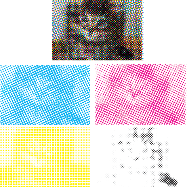
Practical limitations also come into play. Software must control the pattern of the ink spots carefully, otherwise they eye picks up a much larger scale pattern called moiré, which is a beat effect where the resolution of the printed material interacts with that of the dot screen. Though not the only choice, we often use a rosette pattern, at carefully chosen different angles for the four different colours (Fig 3). Also, the amount of ink put on the paper is important: too much of all four colours in any one place and it can become soggy and tear.
So, if the number of spots is proportional to the tint, then we’d need 256 spots to represent all possible tints of a single colour. That is, an 8 × 8 grid. For the ideal 300dpi picture, that means 300 × 8 dpi spots, or a resolution of 2,400 dpi. Many presses and domestic printers can’t achieve that, and use only 1,200 or so, limiting the range of tints they can produce. European manufacturers often make high quality printers based on 2,540 dpi, a 10 micron (millionth of a metre, thousandth of a mm) dot pitch.
When printing text, this additional resolution also means black text an be extremely sharp. Even under a magnifying glass, text will look pretty smooth at these resolutions. (A monitor can achieve similar quality because it can display shades of grey representing the proportion of a pixel which solid black text covers, which fool they eye into seeing a sharp edge). However, text (or other edges) in an image are still limited to the basic 300dpi, so will appear somewhat less sharp than text produced to fit the native resolution of the printer, and the spot patterns will produce a certain fuzziness, especially on poorer quality printers, when intermediate tones are printed.
Adjusting resolution
If you are using WordPress to host your images, then you already have the means to adjust resolution for emails (as well as in your website, which is the original purpose). When you upload an image to the media library, WordPress itself creates multiple copies of your image at various sizes (usually at three sizes plus the original and a square thumbnail often used in image choosers, depending on WordPress settings; if you want more variation, plugins are available to produce more intermediate image sizes).
Then, it is just a matter of choosing the most appropriate of these for the size you want to display at, as shown in Fig 1.
However, this isn’t a suitable approach for paper images, where you will most likely need to use an image editor.
image editors
To adjust resolution of an image, you need an image editor. The most widely known is Adobe Photoshop, but this is expensive and overkill for just adjusting the number of pixels. Gimp is a fully-featured, free image manipulation app. Many others are available relatively cheaply, such as Pixelmator Pro on Mac.
However, both Windows and Mac come with tools for very basic image editing, including adjusting resolution: Windows Paint and Mac Preview. If Paint isn’t installed on your PC, you can get it from the Microsoft Store app.
On Windows, In Paint, use Resize on the Home Menu to scale down the pixels. You’ll then also want to crop the overall image size.
On Mac, in Preview, use Adjust Size on the Tools menu.