Tinymce is the rich text editor used by Cameo, for editing templates and some form text. Tinymce version 5 has been available for a while; it has now been phased in to Cameo. While not necessarily being at the ‘bleeding edge’, it’s good to keep third-party components up-to-date, to pick up bug fixes, for security reasons and because browser changes sometimes make older software no longer viable.
Contents
Changes
While there isn’t much change to what you see (just a slightly modernised user interface), there are significant non-upward-compatible changes to the tinymce API (the code which links Cameo to tinymce) between version 4 and 5, which have meant a fair bit of rewriting on the Cameo side. The two versions were both available for a while, in case there were problems with the new version, but the old version 4 was removed on 14 May 2020.

New substitution selector
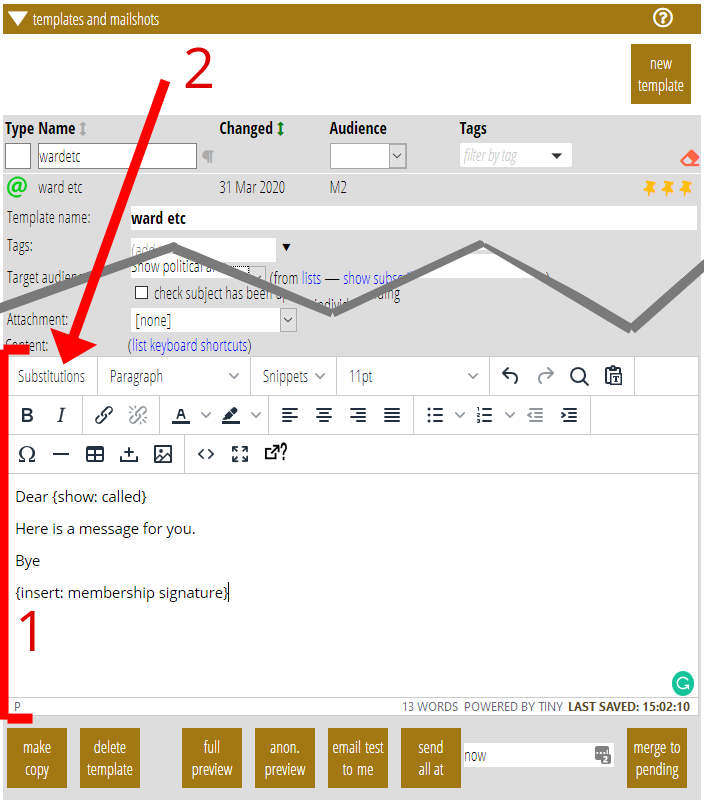
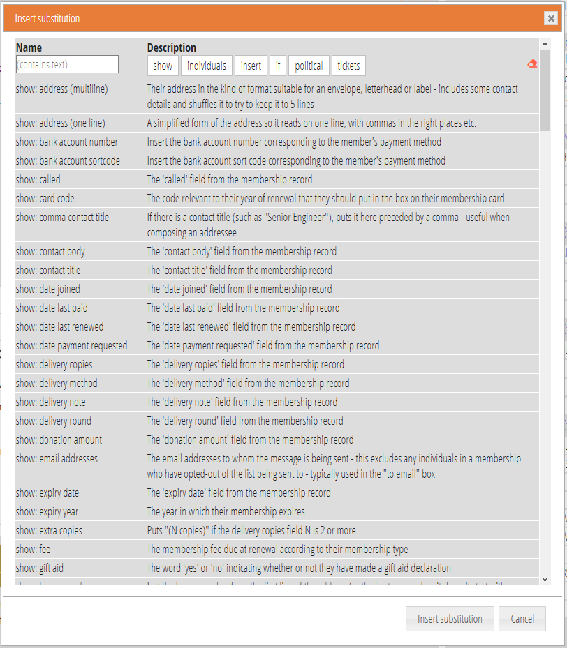
I have also taken the opportunity to replace the substitutions menu in tinymce version 5. Previously this was a two-level drop-down menu supplied by the tinymce editor, with a very large number of entries in which it can be quite hard to find the entry you want. Instead, the new version is just a button (Fig 1: 2) which opens a box listing all the substitutions from which one is selected (Fig 3).

The new box generally has more space to help the selection. It:
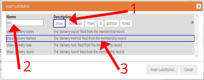
- has filters to display only substitutions in different categories (the equivalent of the top-level of the menu previously, but you can have more than one; Fig 4: 1),
- has a text filter which displays only those substitutions containing what you type (Fig 4: 2),
- shows a longer description alongside each substitution (Fig 4: 3), which makes it easier to see what it does (previously this was shown if you hovered over the menu entry for a substitution, but this was limited by tinymce, and in any case version 5 has done away with these hover pop-ups or tooltips)
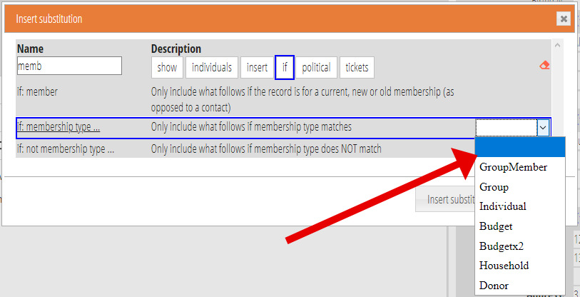
- for substitutions that need additional information, this is now combined in the same box, rather than a separate box popping up afterwards(fig 5). For example, for
{if: contact type ...}you replace the ellipsis so it becomes{if: contact type Officer}. When you select such a substitution, you’d also choose the “Officer” bit from a menu alongside. - sorts the entries better: in particular a
{if: not something}entry immediately follows the corresponding{if: something}entry, rather than being sorted separately strictly alphabetically under “n” for “not”


{show: email identifier}
This update also includes a new substitution {show: email identifer} primarily for including in a custom link to an opt-out form.
