
.
Cameo 11 provides mailshots as template types in their own right, rather than emails whose structure comes from the News Builder button.
The idea remains the same: component blocks of different kinds, one after the other. Customise and edit their text and images.
Now, though, mailshots combine block construction and text editing together. Flipping between an overlaid panel and the email text editor is no longer necessary. Block controls overlay the content, rather like the form editor.
Contents
Background
Editing the structure and text of a mailshot separately was a little clumsy. Cameo 11 introduced a wider range of template types. This broadening allows each template type’s editor to differ: to more closely match the template structure. Mailshots now have their own editor in place of the general formatted text editor, like reports.
News Builder borrowed from WordPress’s block editor; mailshot templates take this analogy further. The mailshot editor also takes inspiration from Cameo’s form editor.
In some browsers, the text editor struggled with the whole of a long mailshot. Mailshot templates no longer edit the whole text of the template at once, so that should improve.
Getting started
Email templates previously composed using News Builder now appear as mailshot templates. Mailshot templates are indicated with a green megaphone icon ( , Fig 1: 12, also known as a bull-horn in US parlance).
As now, you can copy an existing template as the starting point for a new one. (Don’t re-use a template: that confuses what people are opting out of if they use an opt-out link, and other similar personalisation).
To start a new one, click the new template button, as usual, but choose Mailshot as the type. Like making other new templates in Cameo 11, then set a few initial details for the template, such as who it is from.
Opening a new or existing mailshot template then displays the mailshot editor. A new mailshot template comprises a few typical blocks. As part of your overall set-up, you can nominate a mailshot template in admin → system preferences to provide the content for a new mailshot template. That is rather like copying it, but only the content.
Editing a mailshot template
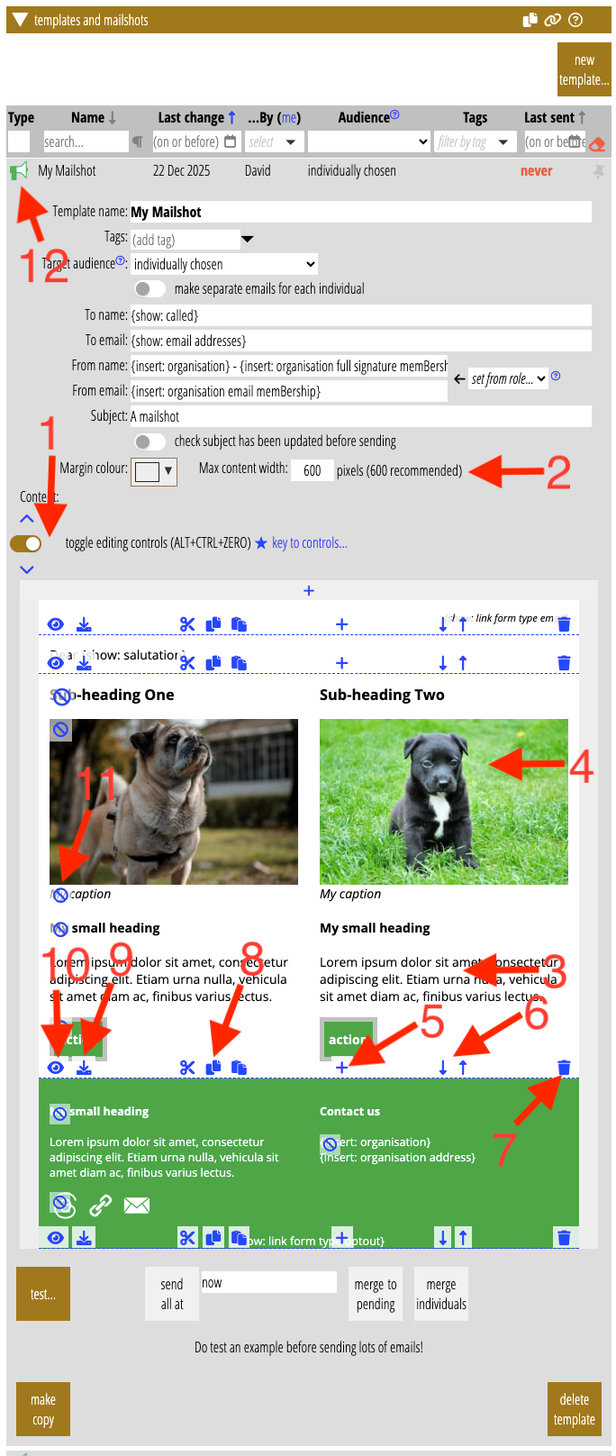
Like the form editor, the mailshot editor overlays blue control icons over the content for you to customise it (Fig 1). A toggle button just above the content lets you hide the controls (Fig 1: 1). This button stays on the screen as you scroll down (you can also use the keyboard shortcut ALT+CTRL+O (letter O; ⌥+⌘+O on Mac). The same area also provides quick navigation to the top or bottom of the content and a key to the controls.
Two further controls inherited from News Builder, above the content, set overall appearance: the width of the email and its margin colour (Fig 1: 2).
When you hover over a block, you see a dashed outline, identifying the block.
- Click in a block to edit its text, using the familiar formatted text editor (Fig 1: 3).
- Click an image to replace it with one from your website media library using the familiar image selector (Fig 1: 4; you can also use the image button in the text editor).
individual block controls
Individual block controls appear at the bottom of each block (on a semi-transparent overlay; Fig 1: 5 – 10, applying to the block starting Sub-heading One and ending with the two action buttons). Unlike News Builder, there’s no need to select blocks (because each block has its own set of controls).
- Insert a new block between this block and the next using the plus icon. A panel pops up to choose the block (Fig 1: 5; this is the equivalent of News Builder’s right-hand column).
- Move the block up (above the previous one) or down (below the next one) using the up and down arrows. Fig 1: 6.
- Remove (delete) the block with the bin icon. Fig 1: 7.
- Cut, copy and paste the block using the standard icons. This uses your computer’s paste buffer. Paste inserts the cut or copied block between this block and the next, like adding a new block. You can paste a block from one template into another. It’s also easier to move a block a long way by cut and paste rather than repeatedly pressing the up/down buttons. Fig 1: 8.
- Save block. This adds a customised block to the library of blocks for future re-use. It appears in the list of blocks when adding a new block. Fig 1: 9.
- Set options for the block using the eye icon. Pops up a box to remove parts of the block you don’t want (for example, picture caption or subheadings), and apply formatting, colour, etc. to them. Find a few more specialised options here too, like event or social media icon selection. This is the equivalent of News Builder’s left-hand column for a selected block. Fig 1: 10
- You can also remove block parts using the cancel icons alongside them, without using options. Fig 1: 11.