The image selector now has an automatic ideal width option, selected by default. That means you should no longer need to think about image sizes so much.
Contents
Background
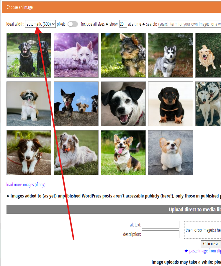
Cameo’s image selector lets you include images from your media library (or elsewhere; Fig 1). Many media libraries (WordPress, Craft) offer the same picture at multiple sizes, so you can choose one appropriately sized for the page, screen capabilities and bandwidth.
Ideally, you wouldn’t have to think about this. The recipient’s device would choose, as it knows better what is appropriate. That is indeed what browsers do, when given a list of possibilities in the HTML (called a srcset). Unfortunately, though, no email apps yet choose the most appropriate image automatically. They ignore srcset information. That includes most webmail. GMail webmail, for example, actually removes the srcset information, even though it is using a browser to display it.
Cameo’s image selector provides a control at the top left for the width you would prefer to use. Cameo selects the next size up that is available for the image you choose.
If a page displays an image much smaller than the actual number of pixels in the image, then the recipient receives too much data. That’s especially a problem if you include an image as it is produced by a camera, which is far too big for email. That makes it slow to load and potentially expensive for sender and recipient. On the other hand, if it is much higher, the image appears fuzzy.
This important setting is often overlooked. Therefore, Cameo now chooses a size automatically by default. You can still override this by choosing your own preferred size, but on the whole, it should now “just work”.
Here are the rules we now apply:
Inserting a new template image
When you insert a new image (usually in an ordinary email template, not a mailshot), the automatic setting is 500 or 600 pixels. For a WordPress media library, this often means we select an image 768 pixels wide, the next size up. However, WordPress applies this to both width and height when it decides the sizes to sample, so for portrait format pictures, it may be less. Also, some WordPress installations change the size (and number) of alternatives.
We’ll also display the image at that automatic size initially, unless:
- the only available variant is smaller, or
- that makes it wider than the available space.
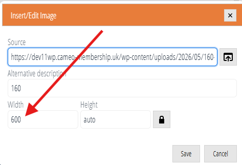
That may mean your images display larger than they used to in ordinary emails, say if you had an ideal width of 300 pixels selected previously. You could use the handles on an image to resize it after insertion. But it is easier to change the width in the text editor’s image box before inserting it (Fig 2; we recommend always leaving the height as auto).
Even if you do that, the chosen image size may have somewhat more pixels than previously. That’s intentional. Smaller screens often cannot display images and text side by side. Instead, they display a picture on its own with the text above or below. Ironically, that is often wider than you would display it on a larger screen. Previously, working on a desktop, you may have inadvertently included an image that had too few pixels for the size it displayed on a phone.
Replacing an existing template image
When you replace an existing image, we’ll still choose the variant of the replacement upwards of 500 pixels wide, unless you choose a non-automatic setting.
However, we’ll then display it at the width of the image you are replacing. This applies to ordinary emails, but also particularly to mailshots where you usually replace a placeholder image. The image may be taller or shorter than the original, though.
You could change the display width in the editor’s image box, after selection, so it differs from the original image. However, a mailshot image never displays wider than the mailshot column where it appears,
- no matter how large the actual image selected, or
- what you set the width to manually in the text editor.
Small images
Sometimes the original image is so small that it doesn’t have a variant wider than the automatic or manually-selected number of pixels. In that case, we choose the largest available (often the only one).
However, if the displayed width would be larger, we replace that with the actual image width instead. Previously, images may have displayed too large in these circumstances, leading to fuzziness.
Other images
You don’t always use images in templates. For example, events offer a couple of images for use in programme summaries etc., in a web page. You may also provide photos of merchandise for a shopping form.
In these cases, we set the automatic size according to context. In particular we’ll choose the thumbnail image size for event thumbnail images. That may mean we show non-square images cropped: we intend them for display in a square. If essential, you can override this by choosing a setting other than automatic in the image selector.